We’ve been around almost twenty years without a website. So we thought we’d do something about that.
We’re really happy to consolidate our work and announcements on this new site. A new website brings an opportunity for a new “look & feel” for the Foundation. Design has come a long way since the Foundation’s origins in 2003.
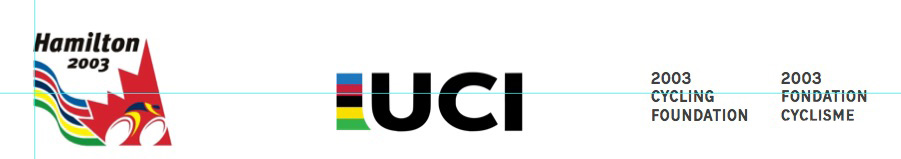
The original event logo was great at the time. We wanted to retain the iconic rainbow World Championship colours, emphasize the blue and red and simplify our name.
Let the tinkering begin…
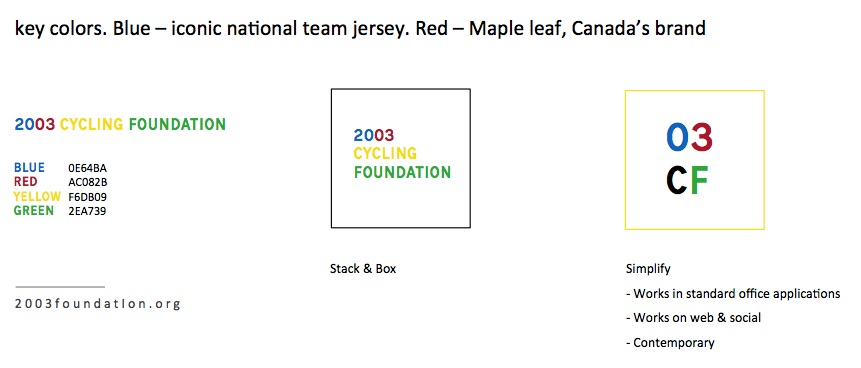
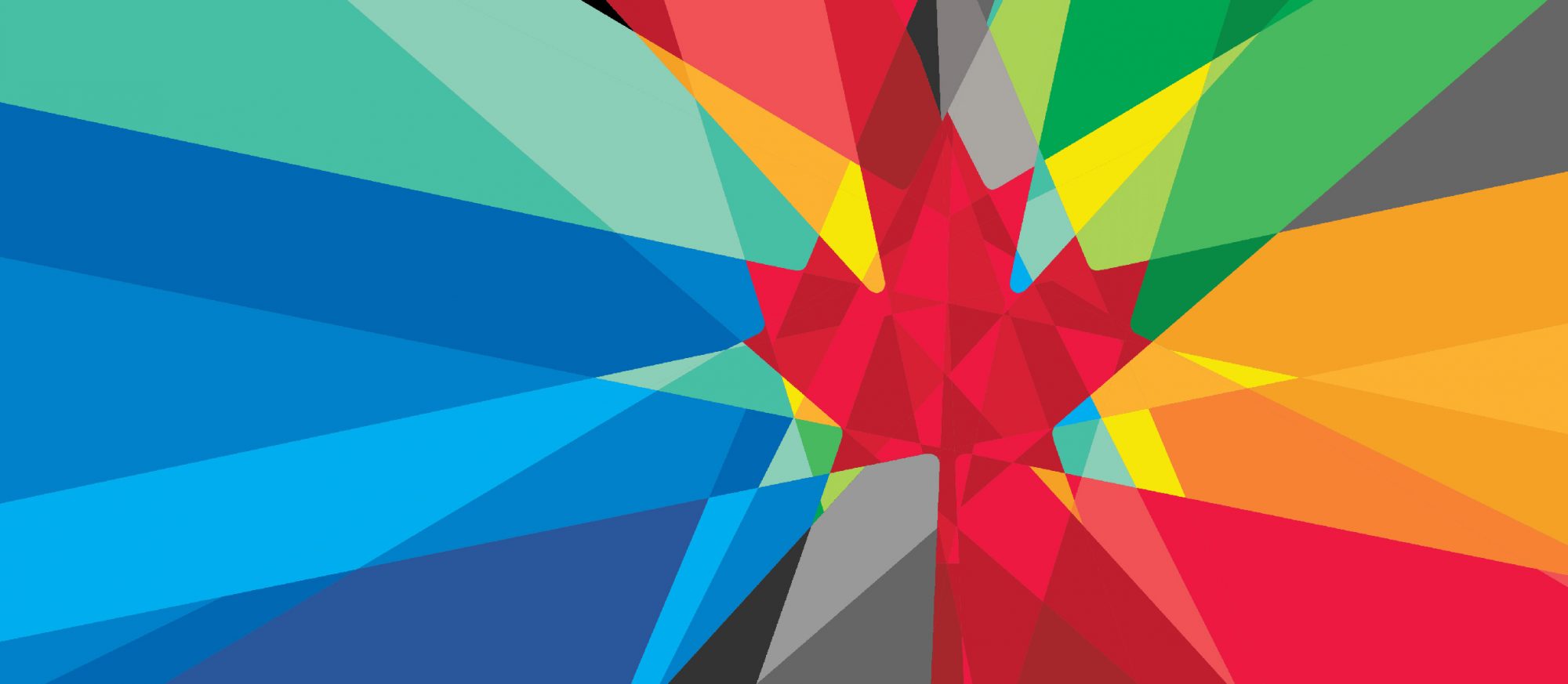
We felt creating a logomark that worked on web/social was important for 2020. As much as it’s important to celebrate the rainbow World Championship colors, good logos must work in black and white, positive and negative.
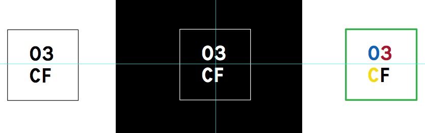
We’re happy with the final result, a fresh look, website and logo to carry us into the 2020’s.
Now we’ll get back to helping athletes be awesome. There’s never been a more prolific time for Canadian road cycling, nor a more important time to work for junior development.